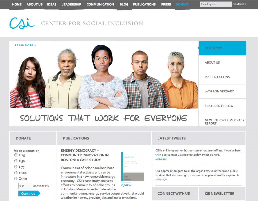
We kept all the essential brand elements that we had devised for the Center for Social Inclusion in 2008, removed the small Flash-animated elements, and put in its place a slideshow that allowed for greater client control of the keynote content. (All the interior content was always under their control.)
The institution also wanted to make a slight shift away from formality and slickness, and further emphasize an “edge.” This needed to be suggested by the website somehow and was too subtle in the original design. We now show this more prominently in the uneven main navigation. It’s still subtle—giving only a hint of this sometimes disruptive nature of the organization—but it satisfied the brand imperative.
We think the new site does a good job of toeing the line between professionalism and edge, while still asserting that the organization remains committed to finding solutions that work for everyone.


Ask for help.
We are kind, thorough and ready when you are. You just need to ask.