Client
New-York Historical Society
Museum & Library
Client
Museum & Library
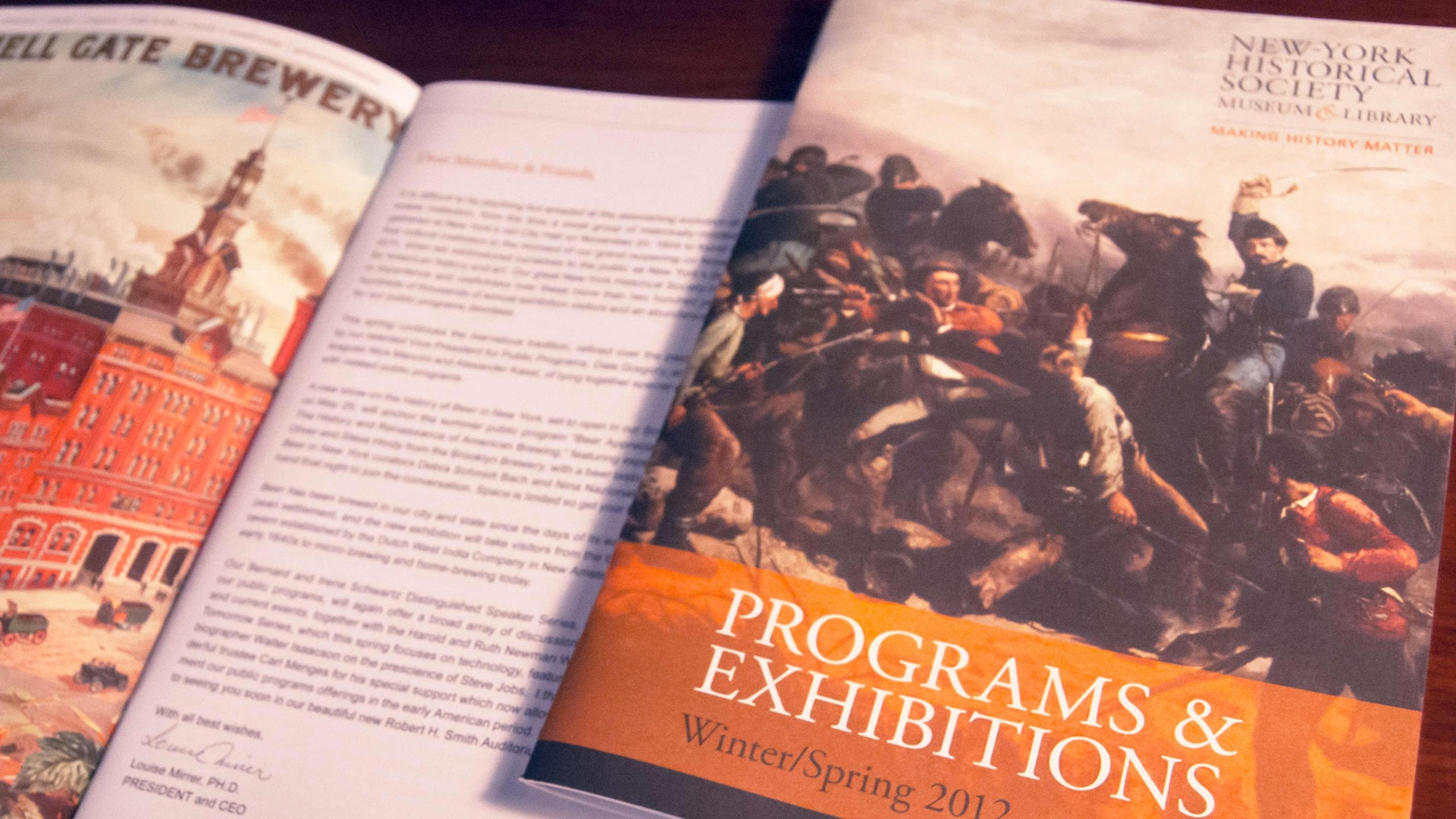
We shifted the brand focus of the New-York Historical Society to history—not art—and the results have been significant sustained growth in both website and museum traffic.

“Tronvig has been working with us for years and consistently delivers strategically thoughtful solutions to problems as they arise. They have a practiced sensitivity to audience need and an understanding of how important a rich understanding of the audience is for any marketing activity.”
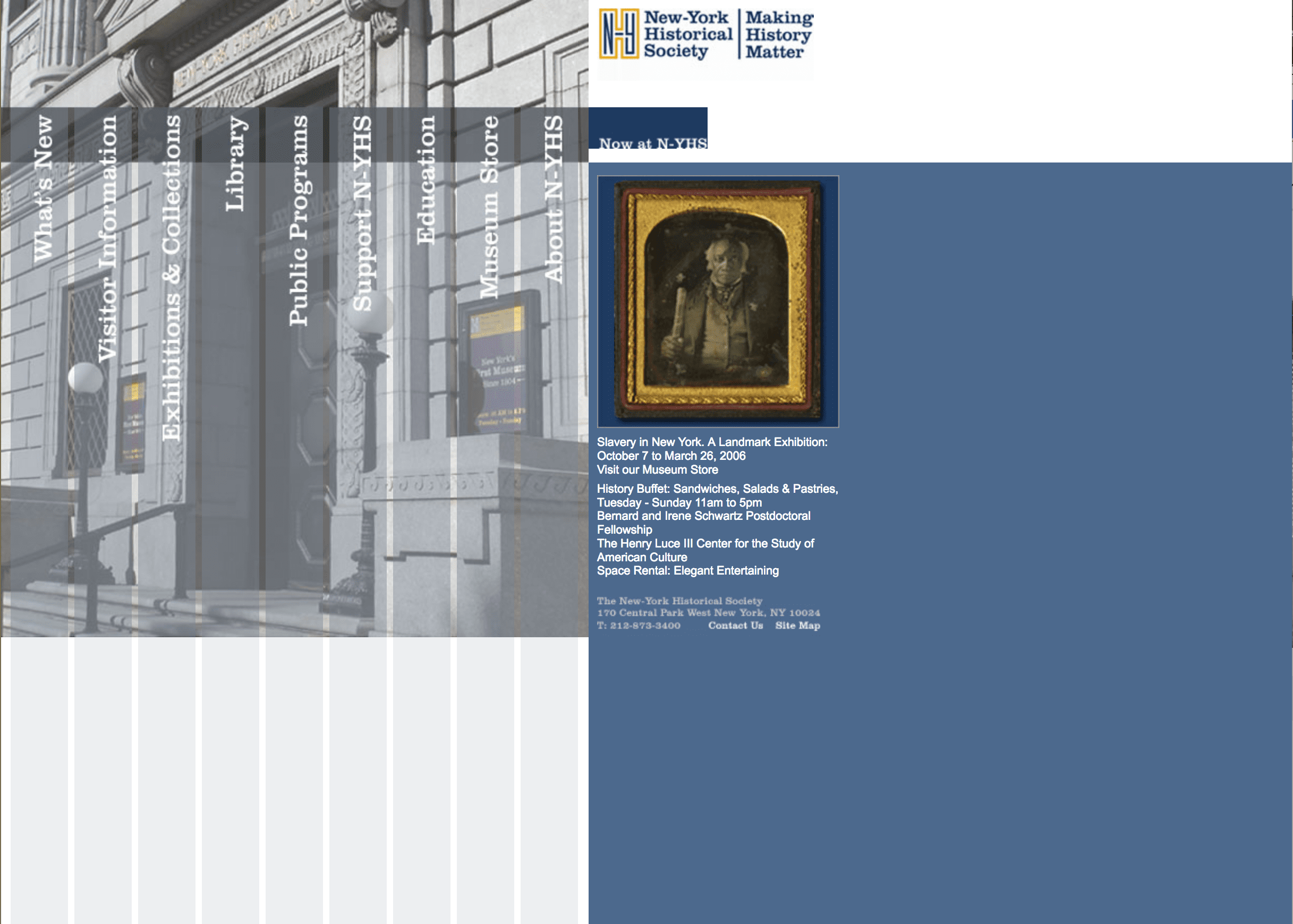
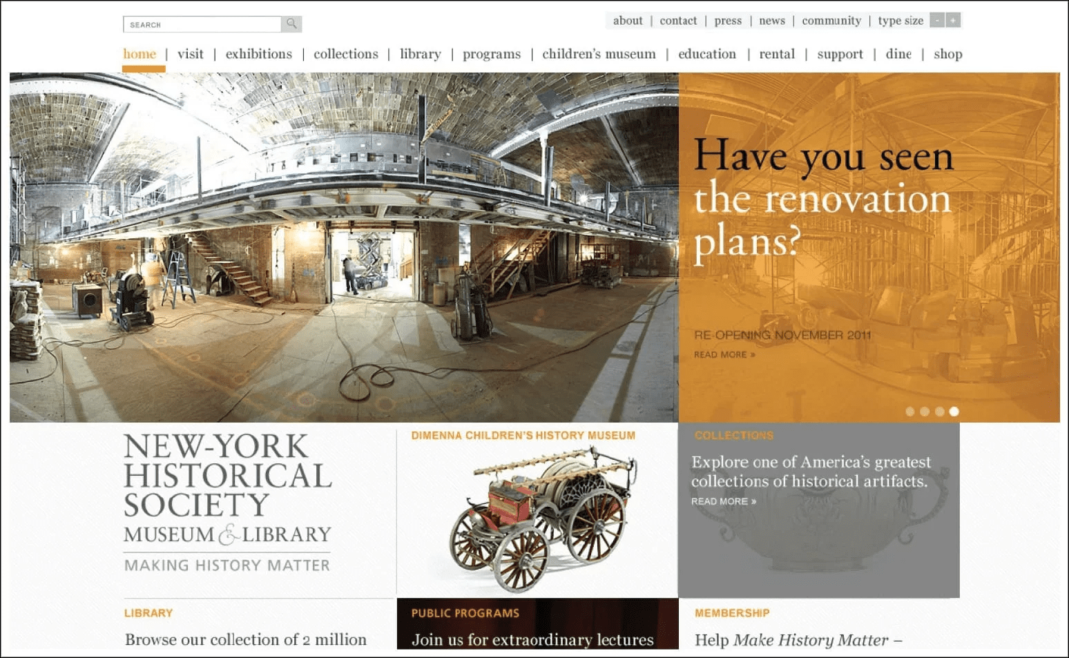
In 2010, undergoing a major renovation, the New-York Historical Society Museum & Library (N-YHS), was generally regarded as a “black box” museum with low levels of public awareness, poor brand recognition, and low attendance, except for certain temporary special exhibitions.
Mixed with positive reviews in the baseline survey of museum supporters, there were pieces of feedback, such as “still struggling to find its place in NY culture” and “small yet unfocused,” that relayed a sense that the institution was having trouble defining itself.
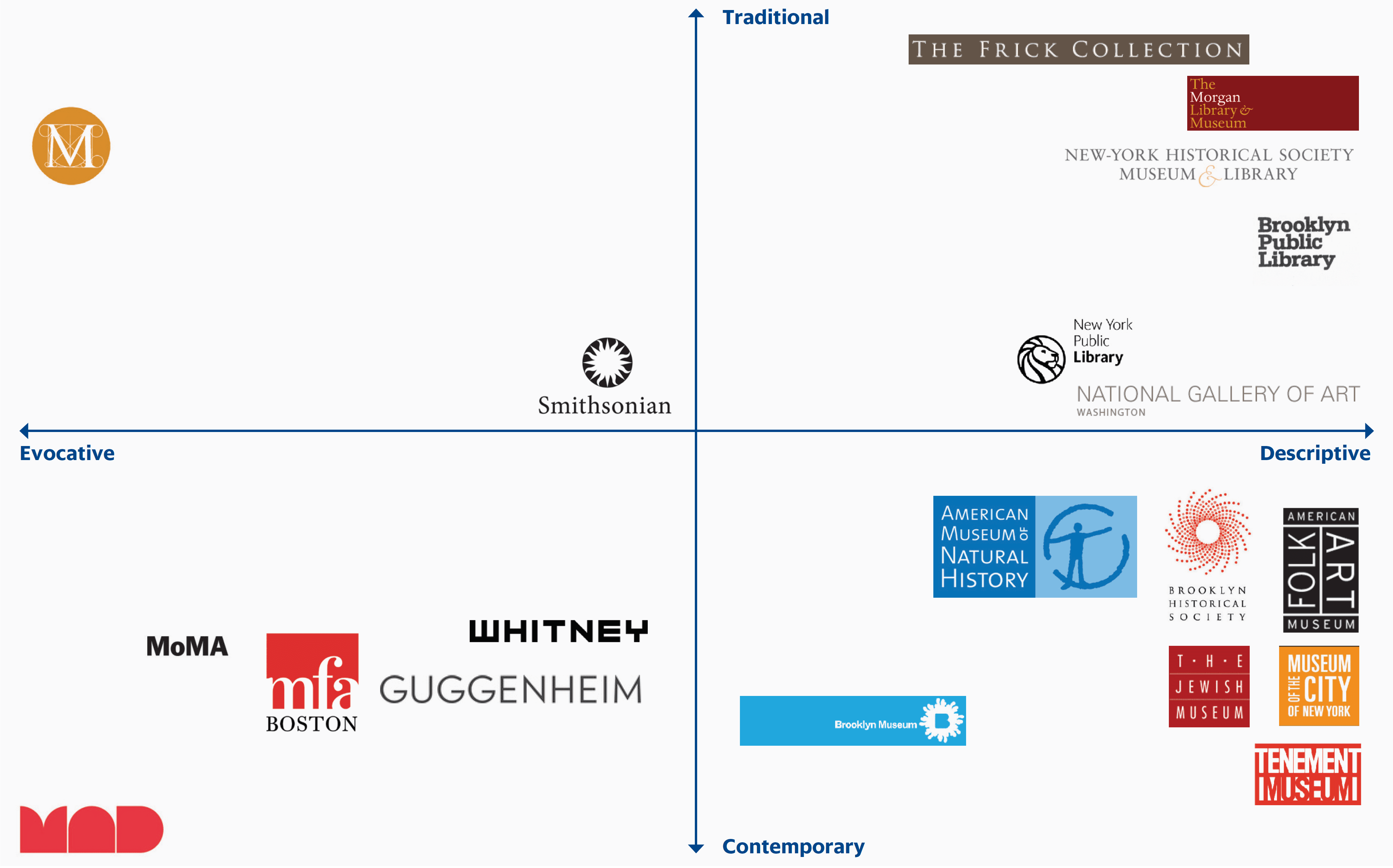
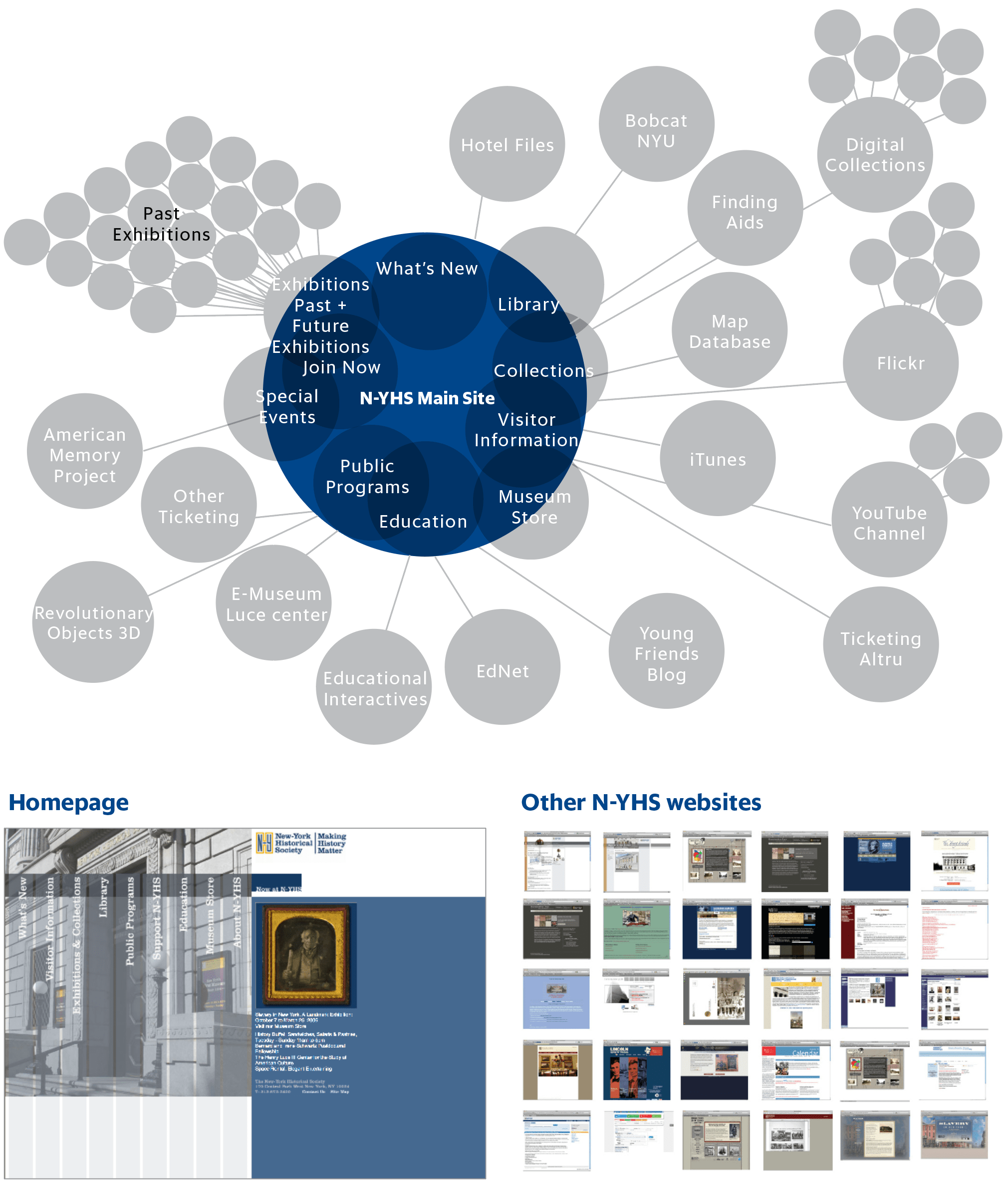
Mapping the visual brand landscape of main New York museums
Research showed that competition with the Metropolitan Museum of Art—a kind of “Met Jr.” status—was hurting the institution. While N-YHS has a great art collection, it was not possible to compete on those terms with The Met.
Please indicate your favorite museum, library or arts institution.
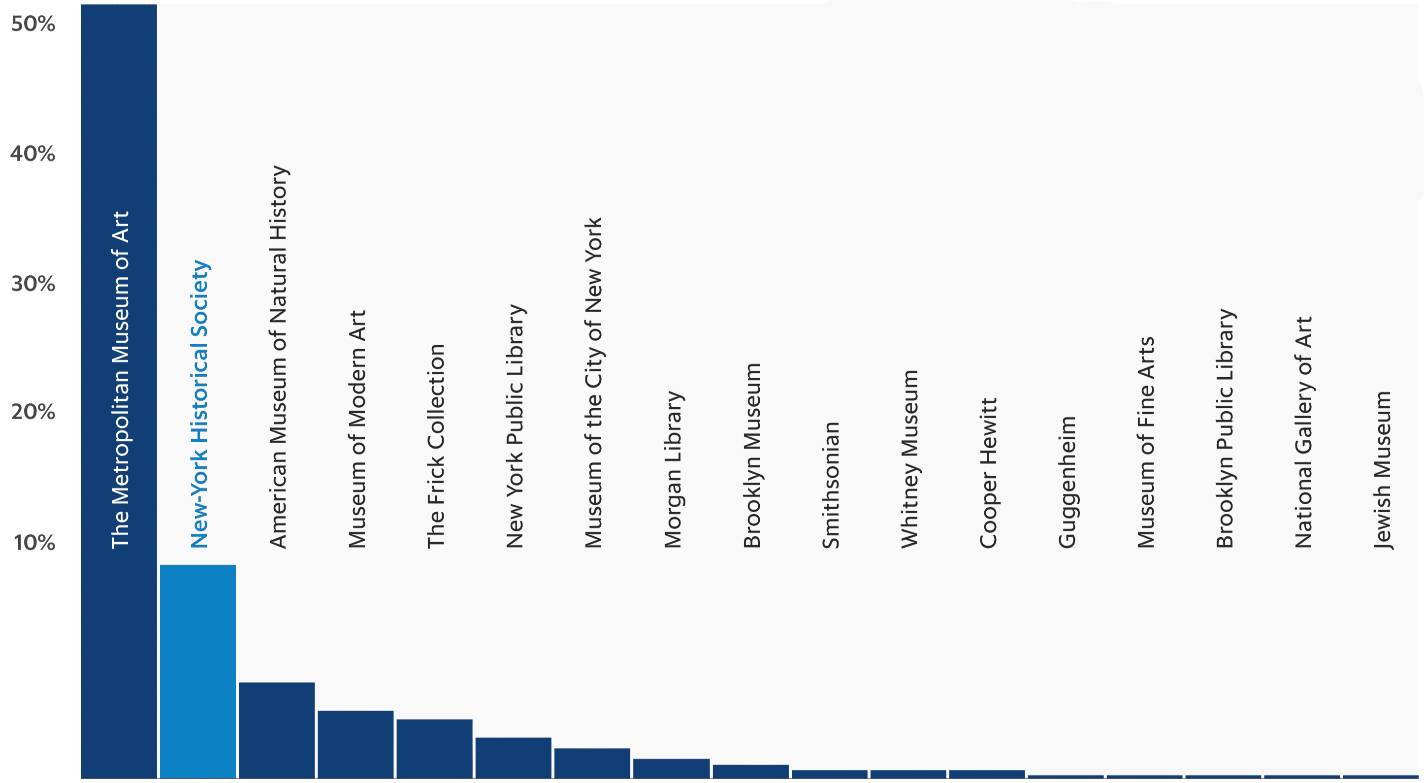
Reinforcing the aforementioned finding that the art collection was not of essence for N-YHS is an overview of what its audience wanted from the organization. While art was on the list, it was far weaker than history and far less distinctive.
Please think about the role of the institution in your life. What would you like it to offer?
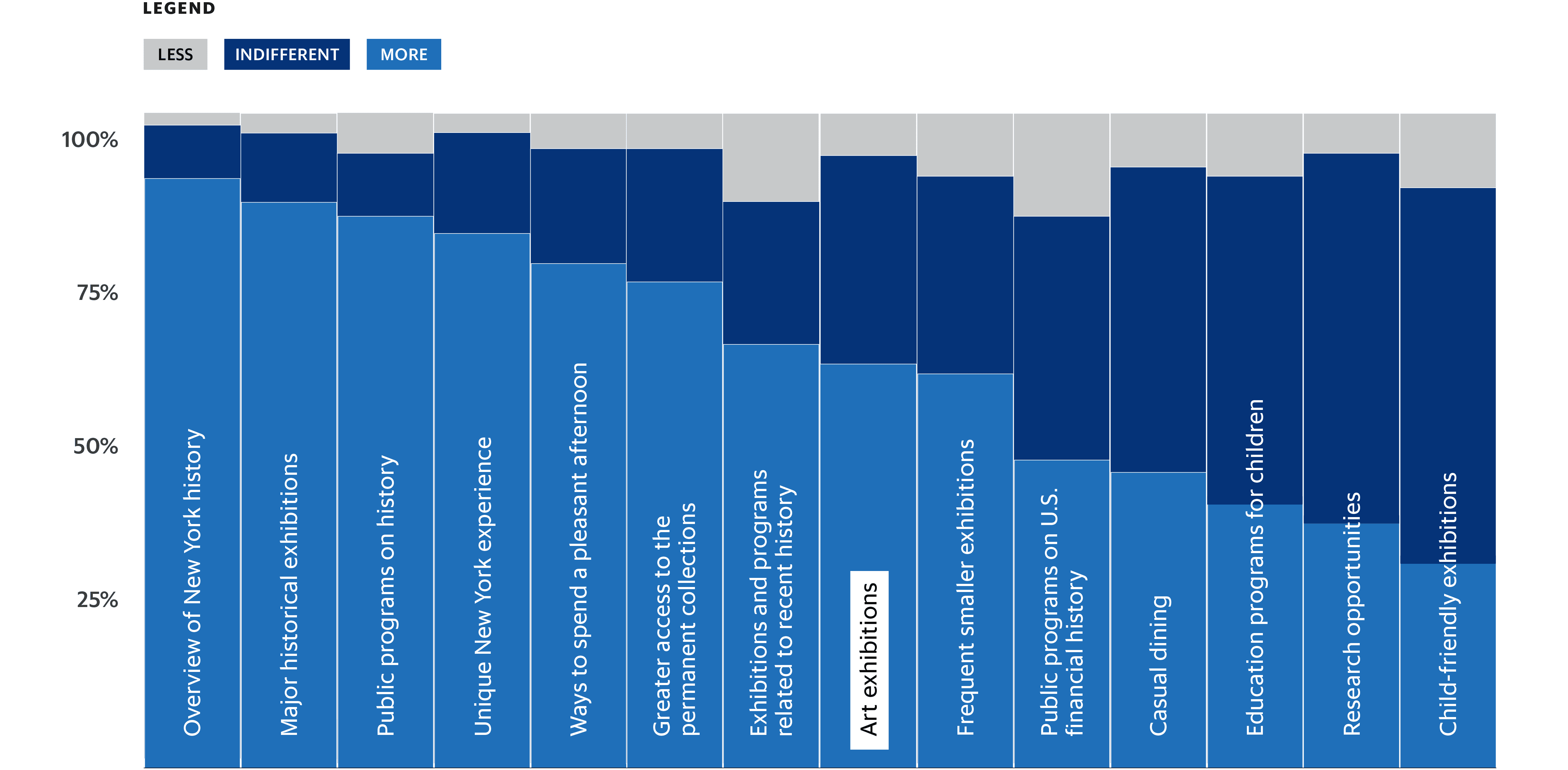
When asked to describe themselves and their tastes as more traditional or more risk-taking and innovative, the core audience indicated a high level of intensity in their interest in history and an inclination toward conservatism. Importantly, there were concerns among the respondents that the institution was at risk of losing its way.
The core audience was also voicing concerns about the museum becoming trendy and “edgy” in a way that dilutes history.

There is extraordinary competition for anyone’s time and attention in New York City, so people choose to do and support those things they are most passionate about. For those whose passion is history, it needs to be made absolutely clear that there is only one right choice to satisfy that passion—the New-York Historical Society. The program series at the New-York Historical Society attracts its deepest and most ardent history buffs.
The overwhelming preference and almost-evangelical zeal for the idea of making history matter served as the foundation of our strategy.
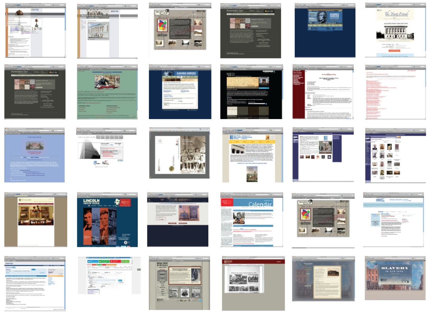
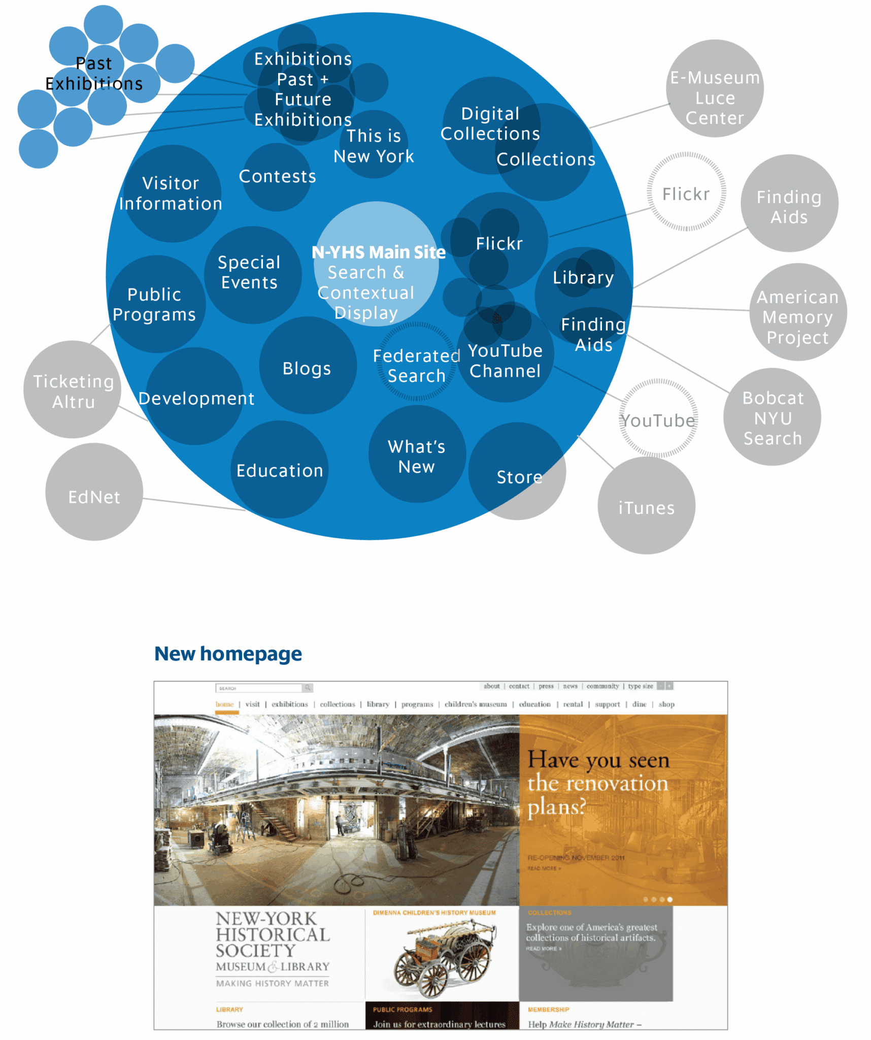
The New-York Historical Society brand was diffused over a wide array of online assets. This needed to be consolidated to accrue traffic and brand power to the main website.
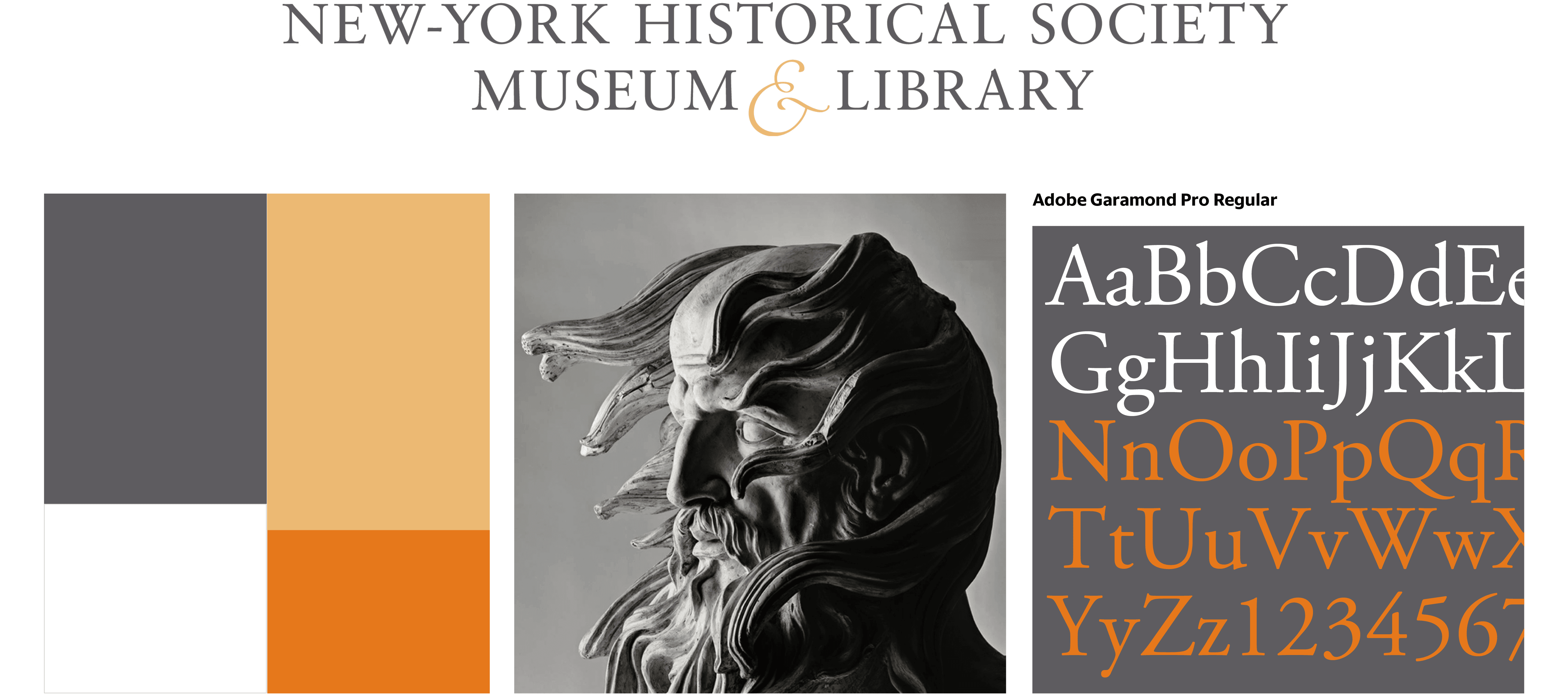
The series of advertisement iterations we created for N-YHS was based on preexisting elements and photography, evolved bolder than their previous approach but not so much as to be “shocking” to their core audience. The color palette Tronvig created was an extrapolation from the N-YHS logo treatment, as well as the selected typeface, Adobe Garamond.
Our gamble was that instead of simply offering the public details about N-YHS exhibitions and events, it would be more effective to engage them with a question dealing specifically with an exhibition and/or lecture. These questions had the potential to resonate with an audience already familiar with N-YHS as well as with an entirely new audience.
A key modality of history is inquiry. We established that all homepage banners and keynote advertising be framed as questions. This served to engage and assert that history is an active process of discovery and is alive today. We presented advertising concepts to illustrate the operations of the brand system we devised.
And although the advertising concepts were not fully executed, the N-YHS website ran with its homepage banners still featuring all promoted content in question form for a decade. The website incorporating both the museum and the library functions ultimately required more than a hundred different page templates.
Our insight pushed us to shift the brand focus to history—not art—and open up the walls of the building so that the collections and exhibits did not remain a mystery to the uninitiated.
The results have been significant sustained growth in both website and museum traffic. Traffic was stagnant or falling prior to the implementation of our strategy and tactical execution. Subsequently growth has been steady.

Tronvig Credits: Sarah Ahrens & Anne Mieth, Art Directors and Creative Director, James Heaton