It has been about a year since we finished rebranding the Center for Social Inclusion (CSI). What is the brand impact of this work? Among the many positive consequences of now having a well-articulated brand that is true to their organizational vision, is that the brand serves to facilitate the process of developing graphic design executions for them.
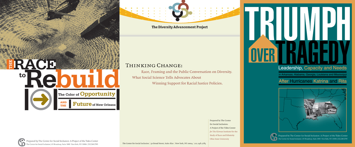
Let’s look at their many published reports. Before the rebrand, every new report was a unique design concept adhering to loosely defined and mostly intuitive brand attributes. Brand acceptability needed to be vetted directly with the executive director. This process relied very heavily on the content of the particular report, which in and of itself is not bad; but this, along with the absence of agreed-upon guidelines, resulted in only tenuous stylistic connections among reports, and both the organization and the designers had to spend a good deal of time developing and approving a design style for each report. The resulting lack of continuity is manifest even among reports designed by the same graphic designer. Here are three former report covers that illustrate this (all produced by the previous design firm):

Lack of a clearly articulated brand proves to be inefficient in at least four ways:
- It takes more effort and time both for the organization and the agency to create these unique products.
- The work requires institutional memory and tight oversight if it is not to become totally arbitrary and dependent on the whim of the designer or the organizational staff person responsible for the product.
- The absence of any concrete guideposts makes it difficult to discuss the relative merits of one design over another, and this results in a much greater opportunity for personal taste to interfere with and slow down the process.
- The end product does not naturally support and enhance the brand. Each product has a brand logo, but each is, in fact, more about itself than the organizational brand, so each is, in essence, its own competing brand product that seeks attention on its own terms rather than contributing its message to the larger brand message.
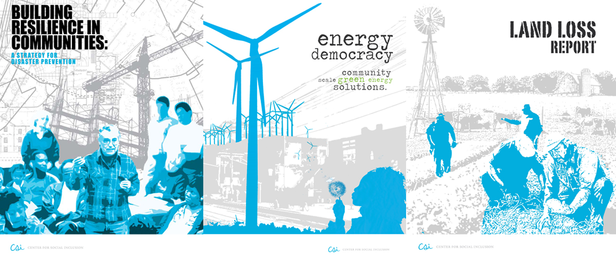
Below are examples of three recent reports produced under the new brand we developed for the Center for Social Inclusion last year. Still allowing for variety in terms of imagery and type treatment, they reflect and support the new positive, open, and approachable brand attitude that is at the heart of the new Center for Social Inclusion brand. Each has different content requirements, yet each is contributing its share in support of the main CSI brand message. And most importantly, every time a brand consumer now gets a copy of a Center for Social Inclusion report, they will immediately recognize it and connect it in their minds with the last one they received.

Does your nonprofit need an affordable way to improve its brand today?
Because we know that not everyone needs or can afford our full process, we created a guided tutorial package for our foundational brand strategy tool: the Brand Pyramid. Watch the video for a preview.
For more information on this brand strategy tutorial, visit here where you will find a fuller explanation and link to a free download of the first video.


Ask for help.
We are kind, thorough and ready when you are. You just need to ask.