Museums exist in particular places. The Bronx Museum exists in the South Bronx; it’s a contemporary art museum located right in the middle of the poorest community in the continental United States, a community that could not be more distant from the stereotype of the whitewall, high art tradition underpinning much of the aesthetics and behaviors that permeate the world of contemporary art.
In working with the Bronx Museum last year, our job was to make the institution more accessible to this local Bronx community so that more people from the Bronx would see fit to take advantage of this wonderful institution and its many offerings (exhibitions and programs). We created a comprehensive and successful museum marketing campaign.
In this case, much of what they were actually doing was relatively well-tailored to the needs of their local community. I discussed parts of what we did in “Advertising in the Facebook Age: Bronx Museum Free Campaign,” but there was also the issue of their website.
When they came to us, they already had a beautiful website. It looked like this:
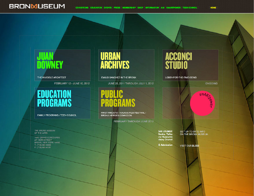
Incredibly beautiful and incredibly wrong
In 2006, the museum completed a major building renovation, and the website made a point of showing it off. In the context of communicating accessibility to the local community, however, this presentation has some serious problems: It shows a fortress. It shows no door. The very air that surrounds its fortress-like walls is otherworldly, rarefied—not the same air that “we” in the community breathe. Indeed, the implication is: “This is a place with air breathable by people who live in another world, a world I have not been initiated into and where I probably do not belong.”
This is a vision that speaks only to the initiates. Looking at the website tells me nothing about how I get in, what I’m going to find once inside, or how I might possibly fit in or reap benefits from the experience. So if I do not already know what I am going to find at the Bronx Museum, if I do not already know how I will be welcomed and that I do indeed belong there, it is impossible to infer from these unfamiliar sign posts. I cannot know what my experience will be, I cannot imagine, I might as well be looking at a description of life on another planet—a planet where I do not expect it will be easy for me to breathe.
I might as well be looking at a description of life on another planet.
Both the intentions and actions of the Bronx Museum were incredibly good. They were doing a great deal right, but the expression of what the institution was—their brand expression—was wrong, and while they had an idea that something was wrong, it was not obvious to them. I’m pointing this out because their case is far from unusual. I see a natural and understandable tendency to repeat these kinds of mistakes across a significant swath of America’s museums.
In an America that is no longer nearly 90% white, as it was literally until the 1970s, there is a looming problem expressed in the statistic, cited in Life Stages of the Museum Visitor, that 91% of all museums’ core visitors are still non-Hispanic white. Whites now make up 66% of the US population, and the percentage is falling. In Bronx County, the number is 10.5%, and it’s even less in the South Bronx. And yet here was a major city-funded institution located in the Bronx unconsciously and inadvertently gazing not at its surroundings, but instead toward the white population of Manhattan over the heads of its local community. This has to sound familiar. I think this scenario—in one form or another—is repeated hundreds of times across the country.
Here was a major city-funded institution located in the Bronx gazing at the population of Manhattan over the heads of its local community.
I’m not saying there is any easy answer to this. The issues at play are a complex mix of socioeconomics, history, culture, and unintentional insensitivity. There is always a tendency for an organization to spend most of its mental energy within the context and confines of its own worldview. There is a lot of inertia for this. The vast majority of decision-level museum professionals are white. They have standing behind them and holding them up in their attitudes, hundreds of years of tradition, behavioral and aesthetic precedents, and guideposts that all point in the same direction—away from this kind of local population. This situation will not change in a day, but it is no small matter, particularly as museums continue to proliferate just as government funding continues to shrink. Museums must inevitably think more deeply about their audiences. This raises a whole host of big picture considerations, issues rightly being debated in the boardrooms of many major cultural and arts organizations.
Who are we for?
Who are we for? It’s a big and important question.
Anyway, The Bronx Museum of the Arts said to us that they want to exist more for the community of the South Bronx, and they got the support to make admission free. We facilitated the process of helping them to tear down the brand walls that separated them from their immediate community. The walls were mostly imaginary, so all we really had to do was show what they were already doing. We had only to make the visual expressions of the institution and its activities a truer reflection of the great work already in progress.
The walls were mostly imaginary, so all we really had to do was show what they were already doing.
We photographed a few different events at the museum with Tom Rauner, and these captured what was actually happening. To this, we added a few shots in the style of Facebook, and from these assets, we were able to create an ad campaign and a new visual language for the museum that was a far more transparent membrane between the community and the institution. The community is now inside the museum, and we show them there. So now if I live in the South Bronx, and I happen to visit the Bronx Museum website, I do not see an otherworldly fortress. I see, instead, an extension of my world. I see an institution that is part of the community it was established to serve. I see an institution fulfilling a mission given to it 40 years ago to bring the arts to the people of the Bronx, and I see in that mission a reflection of myself.
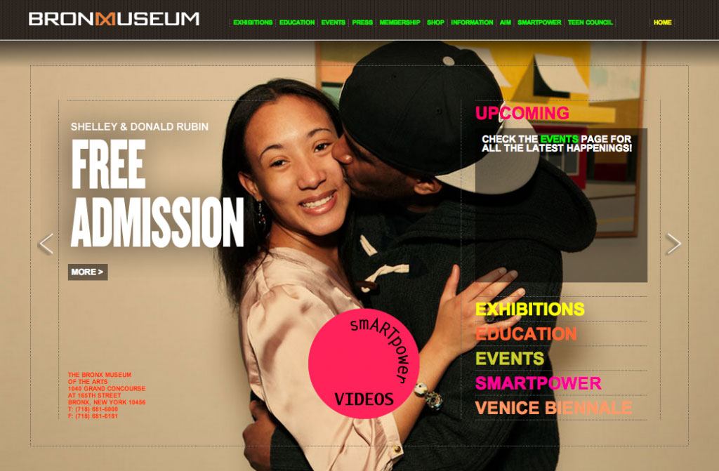
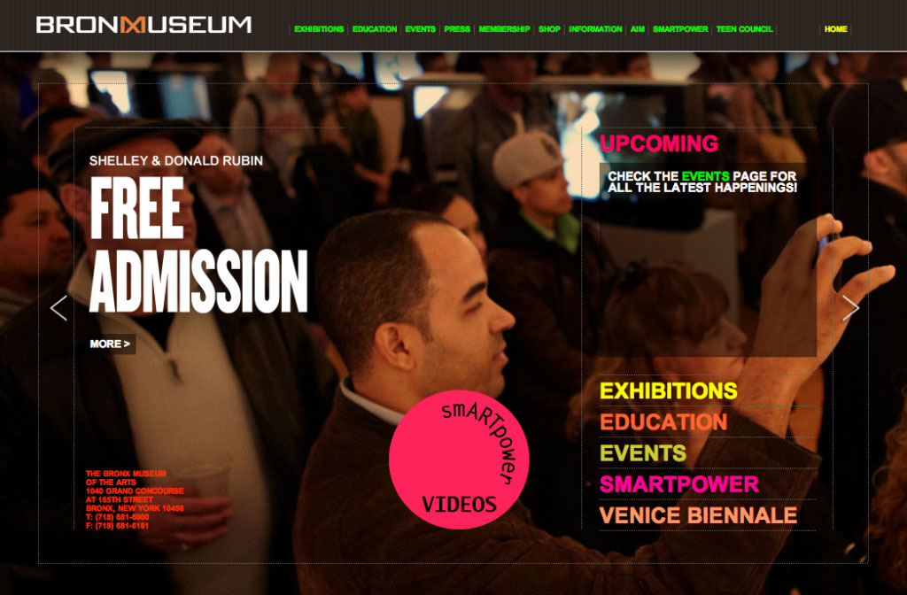
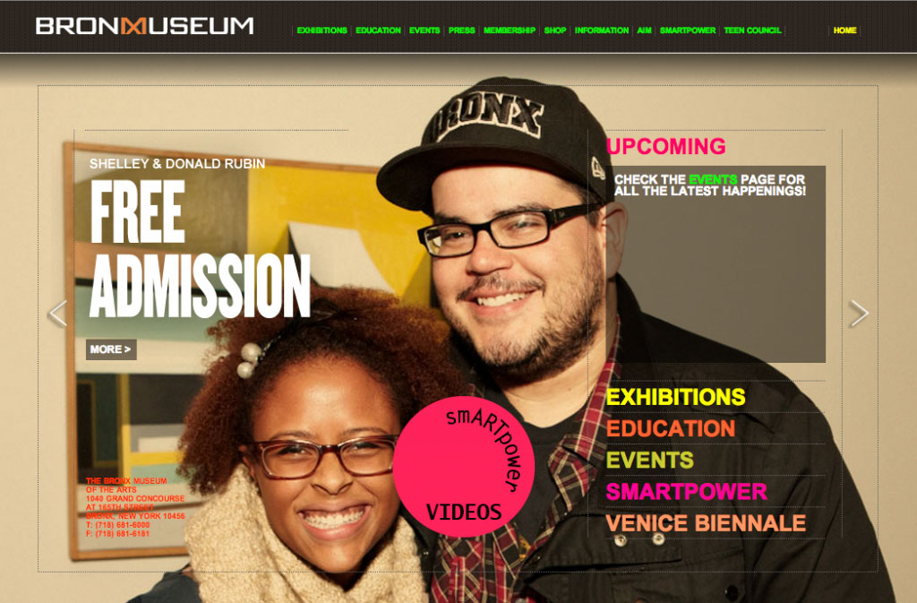
What’s important here is that, in this particular case, our job was relatively easy. This new version of the brand is real, more real, in fact, than what they had before, and the results of this shift have been dramatic—as noted in The New York Times—boosting the museum’s attendance by 50% in the year since the effort began. But even as we were suggesting ideas for the marketing of the museum, we did encounter resistance, “That’s not marketing, that’s a new program.” Indeed, marketing has to come from a product that delivers on the promises made. You cannot show what we are showing here in the marketing of the Bronx Museum if such a reality does not exist. Well, you can, but I think it’s a really bad idea, and it won’t really work.
Ask the question: Who are we for?
Marketing is not subterfuge, but communication. It is important that your product delivers on its promise. So you must first ask the bigger questions, like: “Who are we for?”
Go ahead. Ask it.
If, as you think about this, you don’t like or don’t really know the answer, we should probably have an offline conversation.
See our Marketing Strategy Workshop. Or if your museum does not need or are unable to afford the full process, check out the brand strategy tutorial package for our foundational brand strategy tool: the Brand Pyramid. Watch the video for a preview.



Ask for help.
We are kind, thorough and ready when you are. You just need to ask.